22.4.13
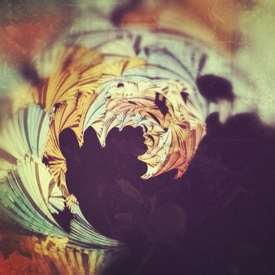
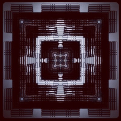
Iconic Architecture Poster Series by Andre Chiote
Posted by
jeremy wahlberg
at
11:07 AM
Labels:
architecture,
art,
design,
iconic,
posters
20.2.13
TEDx Austin
Posted by
chuckadoodledoo
at
10:52 AM
![]() |
| F1 - Suspension Designed and built for TEDx Austin at COTA |
The curators of TEDx Austin 2013 invited Mike Brannon and myself to design and build a custom light fixture to act a center piece during the Washoku Lunch as well as the VIP after party. I'd always wanted to be part of TED and still hope to be invited to speak one day, my talk would probably be about the lost art of craftsmanship and the use of ones hands to build something rather than running to Target to purchase a mass produced blah-bject, but that's whole other topic...
F1 Suspension
So, TEDx Austin was held at the nations only Formula 1 race track, Circuit of The Americas just south of Austin Texas. When designing the light we knew little about track and even less about the exact location the light was to be installed. After a bit of research a concept emerged and side-kicked us in the gut. We had recently procured a couple pieces of salvaged aluminum sheet and thought we would be able to capture the speed of the race track into some forced curves held in tension with aircraft cable. Of course Mike had to sandwich a couple pieces of Dichroic film between the sheets, we then countersunk some Stainless steel hardware to keep it held together and played around with mounting some strip remote controlled LED's on the top side. It ended up being 9'-6" long, 10" wide, and a sexy 1/2" high.
After a quick dissembling, we managed to affix two lengths of cable throughout the fixture to keep the curves in place and act as method to mount the light to whatever structure we would be faced with installing the fixture onto.
![]() |
| Track tower in background, 18 stories tall with alternating colored lighting |
The speakers this year were amazing!!! I can't wait for "The Wire" an Urban Cable installation to be built in Austin, this is definitely the most innovative and probably the most efficient means of mass transportation ever imagined for an urban center. There was an amazing discussion about an ancient Japanese culinary tradition Washoku, my goat pate was amazing btw!
![]() |
| Washoku Lunch |
Favorite quotes of the weekend were " Don't should on yourself, get out there and do something" & "there's only time enough to iron your cape before you have to take to the skies again" both by Anne Mahlum, founder and CEO of Back on My Feet.
-charles
Labels:
instillation art,
lighting,
Lightlink,
product design,
tedx austin
28.2.12
Photomerge in Frankfurt
Posted by
marmeso
at
10:24 PM
Here are a few images I made while in Frankfurt, Germany. This the Ziel by italian architect Massimiliano Fuksas. This was one of the first ones I put together. It is just a simple command in Photoshop but I think it comes out into a really dynamic image. More to come soon...
Best seen in large format. The original files are put together with 12mp RAW images which come out to be almost 6' tall. I cant wait to scratch some money together and print a few of these fulls size. flickr
28.10.11
Busan, Korea 2003 vs. 2011
Posted by
jeremy wahlberg
at
12:03 PM
14.7.11
25.6.11
2.6.11
26.5.11
work sketches
Posted by
jeremy wahlberg
at
6:00 PM
did this little sketch at the office and while it's workstations layouts . . . cubicles . . . i think it has some potential to develop into a sweet series of sketches. what you think?
Labels:
architecture,
art,
made
3.5.11
Wim Crouwel: Total Design
Posted by
jeremy wahlberg
at
7:42 AM
iconographics:wim crouwel
total design - wim's branding and identity company
iconographics short list of world's most iconic graphic designers . . .
wallpaper article on wim crouwel
a poignant figure in design, graphic design, branding and identity - the articles and links say it best!
21.4.11
Infographic on Infographics
Posted by
Intangible J
at
4:03 PM
So this little chart is of special interest to me at the moment. I am currently working on a little graphic for a client and as a result, I have been swimming amidst the infographic industry a bit more often then usual. Ivan Cash put together a graphic that collects and represents data on graphics that collect and represent data. I do wonder if this experiment could be extended into the abstract to create a beautiful self-referential loop up redundant information. (Like an xref in a xref)
I am also curious if anyone has done any infographic work on the side, or just for fun. I have a few examples on my site (link), but I would love to see some other examples from the BIG.
found via Public School
20.4.11
EUTHANASIA COASTER
Posted by
Intangible J
at
8:52 AM
This is a really interesting project by designer Julijonas Urbonas. He has been a background in the field of amusement park development that includes a tenure as a managing director of a Lithuanian Theme Park. His current work, influenced by his interested, is self-classified as the realm of "bodily-perceived aesthetics of gravitational theatre."
This project embelisshes and elaborates on this niche field of research with the proposed "Euthansia Coaster". This is best explained by the designer:
“Euthanasia Coaster” is a hypothetic euthanasia machine in the form of a roller coaster, engineered to humanely – with elegance and euphoria – take the life of a human being. Riding the coaster’s track, the rider is subjected to a series of intensive motion elements that induce various unique experiences: from euphoria to thrill, and from tunnel vision to loss of consciousness, and, eventually, death. Thanks to the marriage of the advanced cross-disciplinary research in space medicine, mechanical engineering, material technologies and, of course, gravity, the fatal journey is made pleasing, elegant and meaningful. Celebrating the limits of the human body but also the liberation from the horizontal life, this ‘kinetic sculpture’ is in fact the ultimate roller coaster: John Allen, former president of the famed Philadelphia Toboggan Company, once sad that “the ultimate roller coaster is built when you send out twenty-four people and they all come back dead. This could be done, you know.”
You can read more about the project here: Euthanasia Coaster.
Also be sure to look through the design group at: Design Interactions.
This idea caught my eye because it used architecture/engineering as a direct tool. Instead of housing a space with a specific function or using a structure for a specific purpose, this project is designed with a direct result in mind: pleasurable death. So much more creative then sticking your member into a light socket, this coaster is a bridge that transfers the passenger between states of being. Like a space tether to heaven. I wonder what other kinds of forms could result from this notion of abstract transference or being.
19.4.11
Just Visiting...
Posted by
jeffrey s nesbit
at
12:32 AM
Joshua Nason / Jeff Nesbit / Victoria McReynolds / Daniel Pruske / Dustin WhiteJust Visiting is an exhibition of work from five Visiting Assistant Professors prior to their arrival in the College of Architecture at Texas Tech University. This exhibition threads the diverse individuality of each professor’s background and trajectory to showcase a momentum of cultivated energy. Through modified timelines, Just Visiting maps previous projects, subjects of inquiry and the various locations inhabited by the visiting professors. Brought together, this features the myriad of ways in which one constructs a life of architecture and contextualizes the temporal nature of now.
See photos here
11.4.11
PeopleFund On Inhabitat
Posted by
jeremy wahlberg
at
11:41 PM
Check out the inhabitat article: PeopleFund
I recall the beginning of this project: an evening conversation with trace paper over pizza at Frank and Angie's. This was the first project I was able to lead with our principal and see the project through all design phases, construction and documentation.
Labels:
architecture,
article,
creativity,
inhabitat,
lawrence group,
made
23.2.11
Private vs. Public
Posted by
Intangible J
at
1:47 PM

I have been attempting to wrap my head around the questions and suppositions that were raised by marQueso in his post about the nature of privacy on the internet. This topic is super dense and expansive and I am staring at an intimidating list of references and articles that touch upon multiple aspects of net neutrality and web privacy.
A simple analog would be the current debate and reaction over the privacy options that Facebook has been (trying) to implement. This is an interesting case and I believe has undertones that relate to marQueso's ideas. Can you really be upset that your sense of privacy is threatened when you are voluntary exposing yourself to a community? In a real life example, would I be upset if my skinny white chicken legs are exposed while taking a swim at the local watering hole?
I may not completely understand the argument on the side of privacy but I think an element of it is how we all engage with the internet. I am referring to the actual action of engagement which includes the atmosphere and setting that the author exists in while he/she interacts with the internet. The majority of participants on online communities are inputting and engaging while sitting alone at home/work/cafe. Maybe the common understanding is that if your physical presence is alone and private while engaging, then the digital avatar should also be under that umbrella of privacy and anonymity.
Maybe this is also why the Farnsworth house was a failure for the client. In a certain setting assumptions are made about your level of exposure and the setting of the home means ultimate privacy. Innovations such as drapes, blinds, tinted glass, etc. have become necessities in order to separate your home from the outside world. I think marQueso is following an important thread here. If the internet is a whole new world of multi-linking, intertwining and reflective communities, then why should it be constrained by the same tenants of our reality.
Maybe the web should really exist as a world of complete transparency. A democratic utopia that is kept in check due to the infinite amount of eyes watching, scanning and surveying all the parcels of information that are freely floating back and forth.
Unluckily, I believe this post has degenerated into a bit of a ramble but I encourage someone else to pick up these pieces and run with it in a new direction.
Question:
Is your online identity separate, analogous or completely opposite of your actual identity? If so then how and why?
19.2.11
El Interneto Para Todos
Posted by
marmeso
at
1:49 AM
Currently writing my essay for graduate school applications. I am tasked with writing about three master's thesis topics that interest me and why. I can only come up with two so i am thinking of just talking about some ideas that i have been thinking of for the last few months. Below is a paragraph I am kind of on the fence about. Some feedback would be appreciated, even if you think its a crazy idea, I would like to know why.

I guess most obviously is that it has nothing to do with architecture. Can any of you guys think of how it can, or if it even matters?
Thanks,
"The internet has led our society towards new paths thought impossible in the span of just half of one lifetime. Unlike television of the 20th century the internet functions through the interactivity. This has lead to new frontiers for our society to explore and has lead to exponential growths in almost every facet of life. In a response reflective of human nature, we have decided that this new power be watched and regulated. This has led to groups of people recording and monitoring our interactions with unbridled access. They also have the power to turn off the web through rules that they have written. What do we gain, and what do we lose from allowing only a select few to have free access to our most intimate information? It is with this question that I propose the idea of a completely free and transparent internet to all. Every image, web site, and email would be available to see and record, with completely equal access. In a sense we could strip the internet of its anonymity. What would be of the internet if we were cognitive of the level of privacy that we truly have? What would people do to regain that sense of privacy? How would our interaction change as we use the internet to access information, but most importantly how would our interactions change when we are out of this cyberspace? I would like to use these questions as a starting point for a new discussion about how we use this machine and the effect it has on our lives. Until we reach an equilibrium with this creation we must continue asking questions until we find an order."
I guess most obviously is that it has nothing to do with architecture. Can any of you guys think of how it can, or if it even matters?
Thanks,
12.2.11
11.2.11
The work of Olafur Eliasson
Posted by
marmeso
at
4:47 PM
In my on going studies with Carlos Cruz-Diez' work I wanted to showcase a few other artists that have been involved with the kinetic art movement.
Olafur Eliasson's bio from ted.com:
http://www.olafureliasson.net

You're making things explicit. 2009

The weather project. 2003

Olafur Eliasson's bio from ted.com:
Denmark-born Icelander Olafur Eliasson has taken the art world by storm -- and the meteorological dimensions of that statement are appropriate. His immensely popular The Weather Project, at London's Tate Museum, immersed spectators in an artificial mirrored environment with its own looming sun (and its own analog of London fog), and attracted 2 million visitors in the process. In the summer of 2008, his four massive waterfalls spectacularly punctuated key sites in New York's harbor -- including one pouring from beneath the Brooklyn Bridge.
Eliasson's works emphasize tricks of light, refraction and scale, and tend to involve each viewer in his or her own unique experience, as in Beauty, which, by passing light through a wall of fine mist, produces a different rainbow when viewed from different points in the gallery. And his works engage passers-by in urban environments -- Eye See You, a project for Louis Vuitton (and meant to publicize 121 Ethiopia, an African nonprofit Eliasson co-founded with his wife), grabs viewers in the street with a beam of light shot from the window by an eye-shaped lamp.
"Many of his best-known works explore architecture and the mechanics of perception, almost as if the fantastical imaginings of Buckminster Fuller were reinterpreted by a cognitive scientist."
~Michael Joseph Gross, New York magazine
http://www.olafureliasson.net
You're making things explicit. 2009
The weather project. 2003
Messenger Bags and Why I hate Velcro
Posted by
Intangible J
at
10:08 AM
If you cannot tell by the name of this article I have a sort of love/hate relationship with everyone's favorite temporary adhesive: Velcro (restricted damnit). I promise I will try to find a way to bend this little rant back into the design sphere.
So recently I decided to purchase a new messenger bag. My current bag and I have a long relationship that began in a fluorescent lit big-box store. It was a long and adventurous relationship that lasted many long hours at the coffee shop, multiple trips across the states, and even a bike accident which resulted in egg yolks and flour forming a pie like shell in the basin of my burlap bag.
But alas, like all good relationships that one must come to an end. The strap is beginning to remove itself from the bag, and fearing the threat of my macbook dropping off my shoulder during a bike ride, I decided to buy a new bag.
Thus the rant begins.
I decided to get a Crumplr bag and though I think their designs are good (as well as the website) I have to say I am dissapointed in the end product. Let me be clear about this review, I do not think the end product is bad, it is fairly good quality, balances well on the bike and is fairly distinctive in design. BUT, what is the deal with all the damn velcro? I have seen this trend in using velcro in many different products and I honestly don't understand it. If someone gets a thrill out of the nerve-wrenching sound that comes from ripping two pieces asunder, then please let me know.
I view velcro in product design like the use of hot-glue in crafting. Somehow velcro transcends its role as a craft making assistant, but the amateur (and dangerous) hot glue must be content with bejewling and making toothpick bridges. Why is the one adhesive that screams tacky and poor craft used in the market while the other waits patiently in the craft drawer?
There really is no need for the little fuzzy squares of hooks and loops. With good design you can insure that the individual compartments in your bag keep their contents safe and secure. Why is the extra lock essential? Do we have velcro for our jean pockets? Is their a lock on your shower curtains? Do you like to sign in a code every time you use your iPhone? Why do we need extra barriers between us and what we need?
Upon reconsideration I really wish that I had bought a badass Chrome bag, or even modified a cheap Rothco model. But now I am stuck with this crackly, inaccessible bag that will soon be modified. I have already made a list of all the things that will be removed and/or replaced. I think the end result will turn out well as the function increases and the frustration decreases.
So can I get some opinions on this subject. A bag is a very personal and unique extension of your personality and design perspective. What do you look for in a bag?
7.2.11
Should I Work for Free?
Posted by
Intangible J
at
8:53 PM
For all of the fellow designers that find themselves trapped into completing free work, please consult this handy digram to measure the value of that possible work. I discovered this handy graphic off of this list compiled by Smashing Magazine.
Smashing Magazine Article
I love the reasoning of this diagram but the nerdy developer in me is crazy about the amount of work that went into making this thing with pure HTML and CSS. If you understand code then check out her source and be amazed by her incredulous control over absolute positioning.
Jessica Hische
Subscribe to:
Posts (Atom)